Set the bar. Use a fern.
JUJU Joints
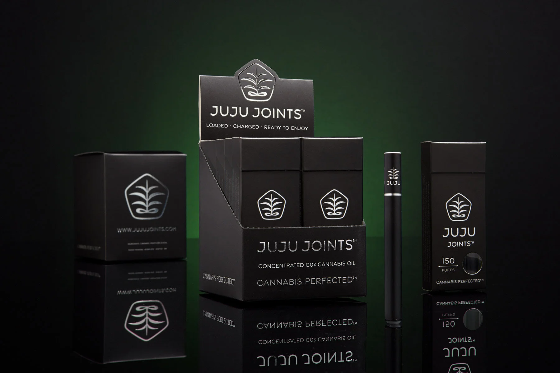
Headquarters created a sophisticated brand identity and packaging solution for a first-of-its-kind cannabis e-joint that set a new design bar in an industry known for stoner clichés.
Brand Identity
Packaging Design
Art Direction
Product Photography: Milgate Studios
Put a Plant on it
The Adinkra Fern, an ancient African symbol, was a required element for the identity so we used it as the conceptual link to the product. We contrasted the ethos of tribal rituals with an upscale visual approach that proved highly successful in market.
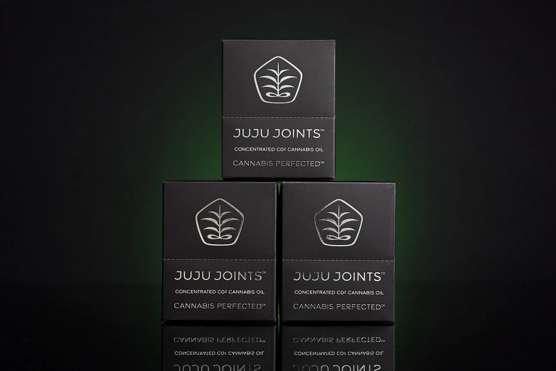


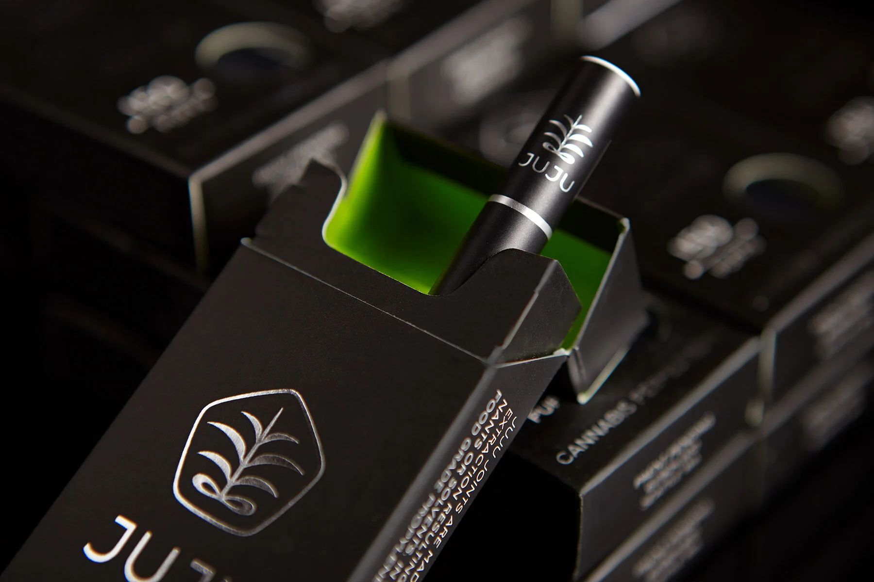
Conjuring Sophistication
Generous foils, built-in displays, and a hidden accent color, are details that bring magic to the packaging and help it stand out on shelf. Moody, editorial-style photography makes marketing materials hip, authentic, and distinct. The combined effect boosted sales far beyond initial projections.


“Headquarters created an identity that embodies the market category, yet clearly positions us as a premium brand. They pushed the original vision beyond our expectations and into the realm of serious recognition and sales.”
Rick Stevens
Founder, Juju Joints